The data are produced by the Centers for Medicare and Medicaid Services (CMS), part of the U.S. Department of Health and Human Services. CMS's main responsibility is to manage Medicare, the Federal program for financing health care for the elderly and disabled, and the Federal portion of Medicaid, the Federal-State program for financing health care for some of the poor, as well as the related SCHIP program. Medicare and Medicaid spent about $938 billion in 2010, which was more than one-third of all U.S. health care spending.
CMS's web site, http://www.cms.hhs.gov/NationalHealthExpendData/, has current and historical data on the U.S. health care system.
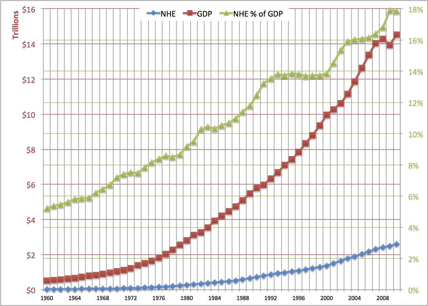
In this chart, the green triangles show the percentage of the gross national product going to health expenditure. Use the green percentage numbers on the right axis.
The red squares, for gross domestic product (GDP), and the blue diamonds, for national health expenditure (NHE), are measured by the red numbers on the left axis.
Looking at the rightmost column of the chart, U.S. national health spending in 2010 was nearly $2.6 trillion (blue diamond). This was 17.85% of the U.S. Gross Domestic Product (green triangle).GDP in 2010 was $14.5 trillion (red square).
In 2010, more than one dollar in six that was spent on anything in the U.S. (that is what the GDP is), was spent on our health care system.
Divide the $2594 billion national health spending in 2010 by the U.S. population in 2010 -- about 308.7 million -- and you get an average of $8402 per person spent on producing health care. Back in 1960, it was only $147 per person.
Both the GDP and national health spending have risen a lot over the last 50 years. National health spending has grown faster than the whole economy, which is why the green line goes up.
The left end of the green line is at about 5%. Back in 1960, health care was 5.1% of the GDP. That percentage rose rapidly from 1960 to the early 1980s, as private and public health insurance expanded. There was a brief pause during President Reagan's first term, when Medicare started rewarding hospitals for discharging patients sooner. A longer pause in the growth of the percentage was when Clinton was President, and private health insurance switched to managed care. In the early years of the Bush II Administration, the percentage of health care in the GDP rose rapidly, but then it almost levelled off. In 2009, the economy shrank while health care spending grew, so the NHE in GDP percentage jumped up. From 2009 to 2010, GDP rose at just about the same rate as national health expenditures, as Obama's stimulus gave us a partial recovery from the worst of the depression.
.png)
This second graph makes it easier to see the growth rates in NHE and GDP. The left axis is logarithmic rather than linear. Constant growth rates are straight lines on this graph, for the red and blue lines. (The green line shows the percentage of the GDP going to health care spending, the same as the first graph.)
Notice that the red and blue lines are a little steeper in the left half of the graph than in the right half. This means that NHE and GDP grew faster, in percentage terms, from 1960 to 1980 than they did from 1980 to 2010.
The blue line is overall steeper than the red line. This shows that national health expendiure's growth was faster than the growth of the whole economy over the whole period. When the blue line is steeper than the red line, the green line goes up. That was so nearly every year, but it was not so from 2009 to 2010.
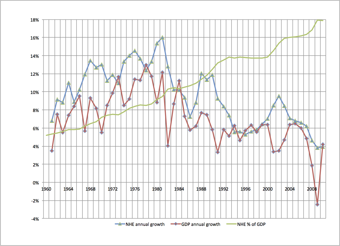
This graph shows the year-to-year growth rates of national health spending (NHE) and total economy spending (GDP), as well as the percentage of GDP going to NHE.
The blue triangles show by what percentage national health expenditures grew each year from the year before. The purple diamonds show by what percentage gross domestic product grew each year from the year before.
For example, the red diamond at the right end of the graph means that GDP rose 4.2% from 2009 to 2010. The blue triangle just below that means that health care spending rose 3.9% from 2009 to 2010.
The green line is just like in the graphs above. It shows the percentage of the GDP going to the health care system. It's scale is on the right.
When the blue triangle is above the purple diamond, the green line goes up. When the blue triangle is near the purple diamond, the green line is level.
Most years, the blue triangle for national health spending is above the purple diamond for GDP. Health care usually risesfaster than GDP. The exceptions are usually years of recovery from recessions, as in 2010.
For 1993 to 2000, the blue and purple are pretty close to each other. In those years, the economy grew just about as fast as national health spending, so the percentage of the GDP going to health spending did not rise much. During 2001-2003, the economy (red line) grew more slowly than before. At the same time, national health spending (blue line) grew faster than before. The percentage of the GDP going to health spending rose quickly. From 2003 to 2007, national health spending and the economy grew at close the same rates. The green line almost levelled off again. Then, in 2008, the economy's growth rate plunged, and in 2009, the GDP growth rate was negative. indicated by the purple diamond at the right edge of the graph. Health care spending's growth rate fell, but not by as much as what happened in the whole economy, so health care's portion of the GDP got bigger. In 2010, the GDP grew about 4%, while health care spending's growth rate was little changed from the previous year.
Health care is generally less "cyclical" than the whole economy. Health care's growth rate did not plunge when the economy tanked. More on this later.
There is a problem with using the GDP to measure economic growth. There is likewise a problem with using the NHE to measure how much health care goods and services people are getting. The problem is that the GDP is based on current dollar values for goods and services. Everything is valued at its price. If prices go up, the GDP can go up, even with no increase in actual production. The distinction I am making is between "nominal" and "real" GDP. "Real" GDP is how much is produced with price changes taken out.
If a medication you buy regularly cost $30 each last year and costs $33 each today, you are spending 10% more now, but you are not getting more pills.
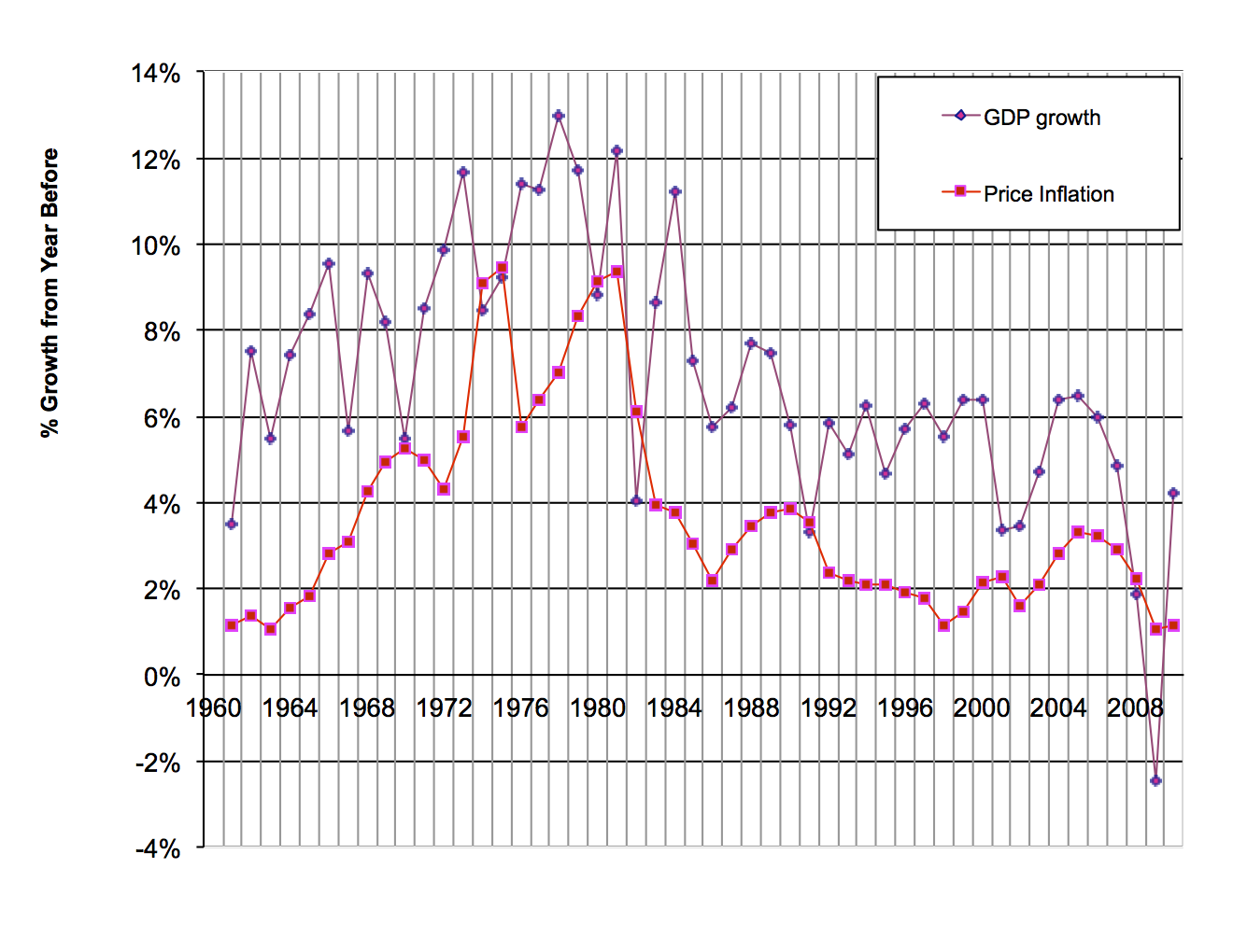
This chart shows how the GDP has changed and how prices have changed.
The purple upper line shows, for each year, the percentage change in the GDP ("nominal" GDP) from the year before. The lower line shows, for each year, the percentage change in prices from the year before. Price changes are measured by the GDP implicit price deflator, which is a price index that uses all of the items in the GDP as its market basket. You can think of the implicit price deflator as showing how much prices for everying increased. (Every year there are new products, of course. Apple introduced the iPad 3 in 2012, and Kraft introduced Bagel-fuls in 2008. Economists at the U.S. Commerce Department do their best to bring new products into the price index in a fair way.)
The difference between the upper line and the lower line is what's called real GDP growth. It is the growth in actual production of goods in services.
On this graph, where the purple line is well above the red line, there was a lot of real growth during that year. When the two lines are close, all of the growth is in prices, not in real stuff. Real production shrank during the years for which the red square is above the purple diamond.
From 1973 to 1981, prices rose fast, especially in the oil crisis years. You can see how high the red line was during those years. Nearly all of the high growth of nominal GDP during those years was because prices were rising, not because actual economic activity was rising.
For the 1960s, 1992-2000, and 2003-2005, the purple line is well below the red line. There was real economic growth during those years.
For 1974, 1975, 1980, 1982, 1991, 2008, and 2009, the red line is above the purple line. This means that real production fell during those years. Those were recession years.
To get the growth rate graph for real GDP, subtract the red price inflation line from the purple GDP line. This gives you the purple line in the graph below.
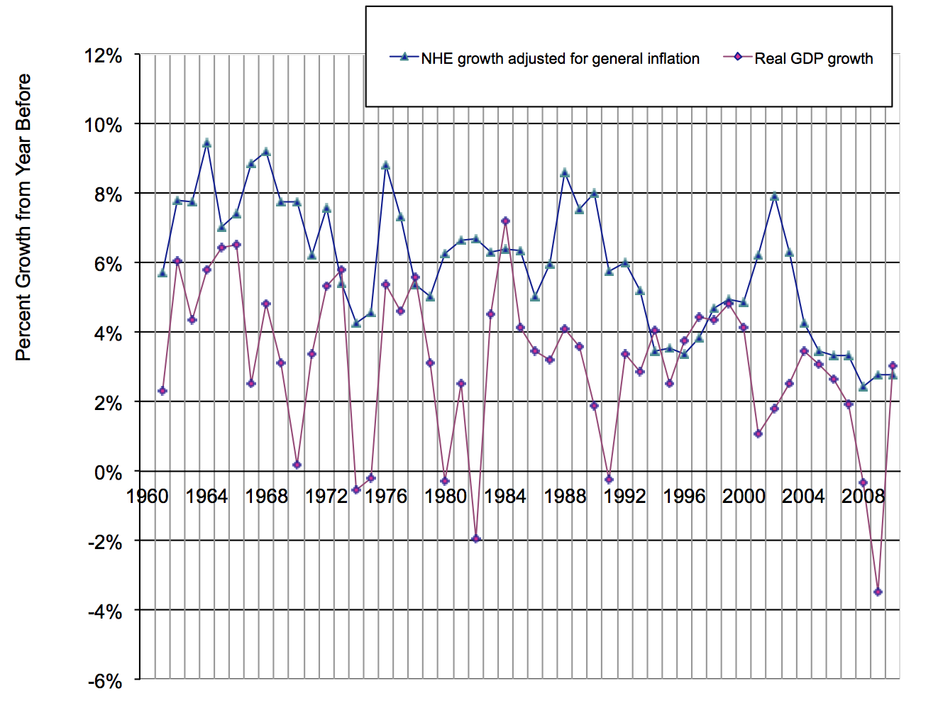
This graph takes general price inflation out of the GDP, and also takes general inflation out of national health spending.
The lower line shows the annual percentage change in real GDP. The upper line shows the annual percentage change in the national health expenditure from the year before, with rate of increase of prices in the whole economy subtracted out.
In this graph, especially the left half of the graph, you see that real GDP growth has jumped up and down a lot. In other words, the growth rate of real GDP can change a lot from one year to the next. From 1992 to 2007, the fluctuations in GDP were not as great as they had been before. Then came 2008 and 2009, which were disasters.
National health spending's growth has not fluctuated as much as GDP's growth. In the graph, notice that the blue line's peaks and valleys are not a big as the red line's. Economists say that health care is less "cyclical" than the whole economy. From 2008 to 2010, when the economy's growth rate took a dive and then came back up, health care's growth was very steady. Construction, by contrast, is a very cyclical industry. In 2008, when the housing bubble burst and the banking system froze, construction just about stopped.
To get to "real" health care spending, you would want to adjust health care spending by health care price changes, not just general price changes. Health care has its own rate of price inflation that is higher than the general rate of inflation.
.png)
This graph gives a rough comparison of how medical care prices have behaved with how prices in general have behaved:
The upper line shows, for each year, the percentage change medical care prices, compared with the year before.
The lower line shows the percentage change in prices generally in the U.S. economy.
The GDP price index and the medical care price index come are calculated by different agencies on different bases.
The medical care price index comes from the U.S. Bureau of Labor Statistics. It is part of the consumer price index, based on the spending patterns of urban workers' families. It is not quite right to compare this with the price index for the whole economy that the U.S. Bureau of Economic Analysis calculates. That's because there are lots of things in the whole economy and in health care spending that urban consumers do not buy. For example, health care spending includes public health, and it includes construction and maintenance of buildings where medical care is delivered. Individual consumers do not buy those things. Take this comparison of price inflation as a rough guide only.
In every year, except for the oil price shock of 1973-1974, medical care prices went up faster than prices in the economy as a whole. Medical care prices rose much faster than general prices during 1985 to 1992. In 2008, general inflation slowed. Medical care price increases also slowed, but not by as much.
Based on that, we separate price changes from real changes in medical care goods and services. Again, this a rough estimate, for the reason mentioned above.
.png)
In this graph, the top line shows how nominal national health spending changed each year.
The middle line shows how national health spending changed each year, with general price inflation in the economy is taken out. This is an indicator of how fast resources flowed into the health care sector.
The pink lower line estimates the real growth rate in the health care sector. All price inflation is taken out. This is actual health care goods and services.
The pink line, if you look from left to right along it, shows you that real health care services grew faster from 1960 to about 1980 than they have since. Real health care services grew some every year except 1986. Real health sector growth in 2008-2010 was low by historic standards, though there were some almost-as-low growth years for health care in the early 1990s.
When there is a big difference between the blue line and the pink line, as during 1975-1981, most of the growth in health care spending is due to rising prices for medical care, not more actual service. When the blue and pink lines are close, as during the early 1960s, most of the growth in health care spending is due to more service being provided.
For 2010, the blue diamond is at about 4%. The green triangle is at about 3%, and the pink square is at ½%. You can interpret that like this: Of the 4% that health care spending grew from 2009 to 2010, one percentage point was more actual services and goods, one percentage points was general price inflation, and 2½ percentage points were health care price inflation in excess of general inflation.
Now let's look at who spent all this health care money.
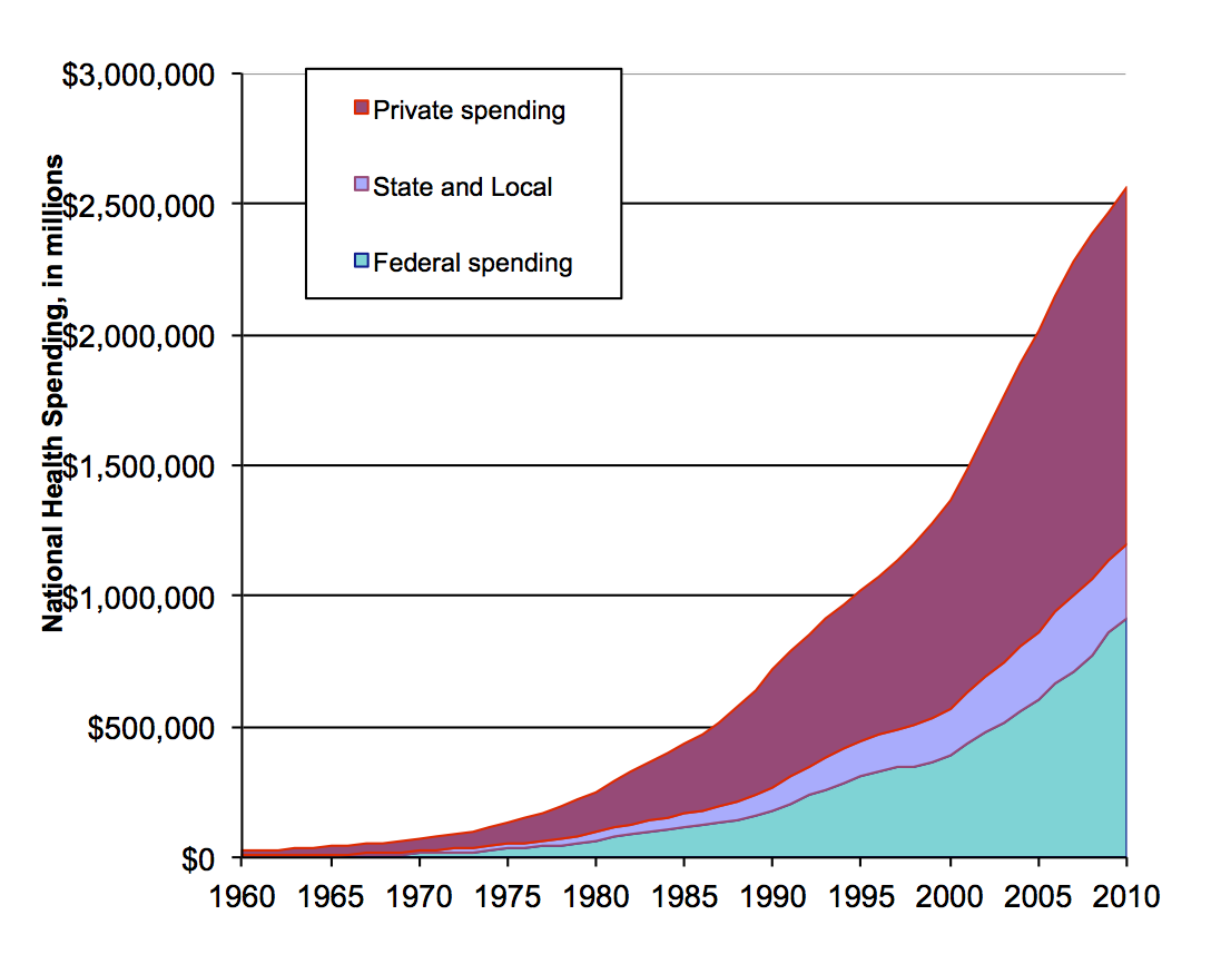
This chart breaks down U.S. health care spending into three categories of spender: private, state and local government, and Federal government. Federal spending is mostly Medicare and Medicaid. State spending is mostly Medicaid. Private spending is mostly out-of-pocket payments and private insurance.
All three categories have gone up a lot over the last fifty years. Federal spending in 2010 was a little under $1 trillion. Total spending was about $2½ trillion.
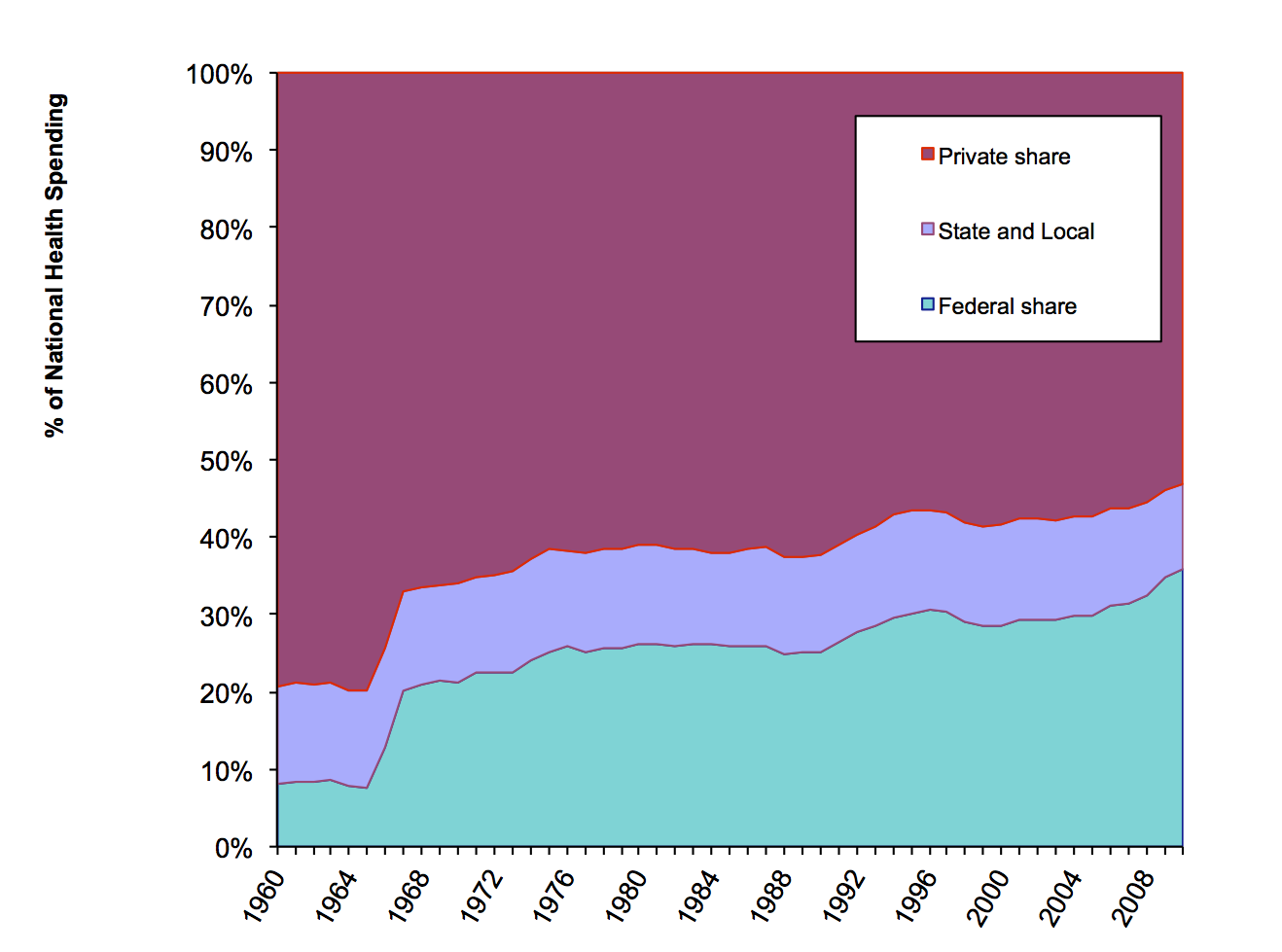
This chart shows percentages. It shows how much of U.S. health care spending was private, how much was state and local government, and how much was by the Federal government.
The Federal government share of health care spending grew over this whole period, from 8% in 1960 to 35% in 2010. There was a sharp jump in the Federal share after 1966, after Medicare and Medicaid started. After that, Federal spending's rose gradually after that, peaking at just over 30% in 1998. The Federal share fell a bit from 1998 to 2000, partly because of Medicare cuts, and partly because private spending grew as the economy grew briskly. Some liberalization of Medicare in 2001, and a slowing of private spending due to the poor economy, sent the Federal share back up during 2001 through 2005. The Federal share rose again in 2006, when the Medicare prescription drug program started. Federal funding for prescription drugs rose by $26 billion in that year. Private spending for prescription drugs fell by $2 billion from 2005 to 2006. From 2007 to 2010, the Federal share rose by about 3½ percentage points, as the private economy slumped.
State and local spending (the middle band) includes the state portion of Medicaid, as well as state and local public health activities. State and local government spending's share is a lower now than it was in 1960. It was nearly 14% in 1960. It was just 11% in 2010. South Carolina is an example of what happened. Back in the 1960's, South Carolina paid for Department of Health and Environmental Control services with state dollars. Much of that is now paid for my Medicaid, which is about three-fourths Federal money. The states' share of health care spending was lower in 2009 than in past years. States have cut back spending as their tax revenues have fallen during the recession. Under Obamacare, the Federal government increased its share of Medicaid costs, allowing the states to spend less without drastic service cuts.
Public spending was over 46% of all health spending in 2010, according to the chart above. That actually understates the role of government in paying for health care, because there is a big flow of Federal government spending that this chart hides. That is the tax subsidy for private health insurance and health spending. Our tax law allows businesses and individuals to deduct health insurance and some health care spending from their taxable incomes, and thus pay less income tax. In effect, the government pays back individuals and businesses who buy health care. If you include that tax subsidy, the public share of health care spending is about 60%.
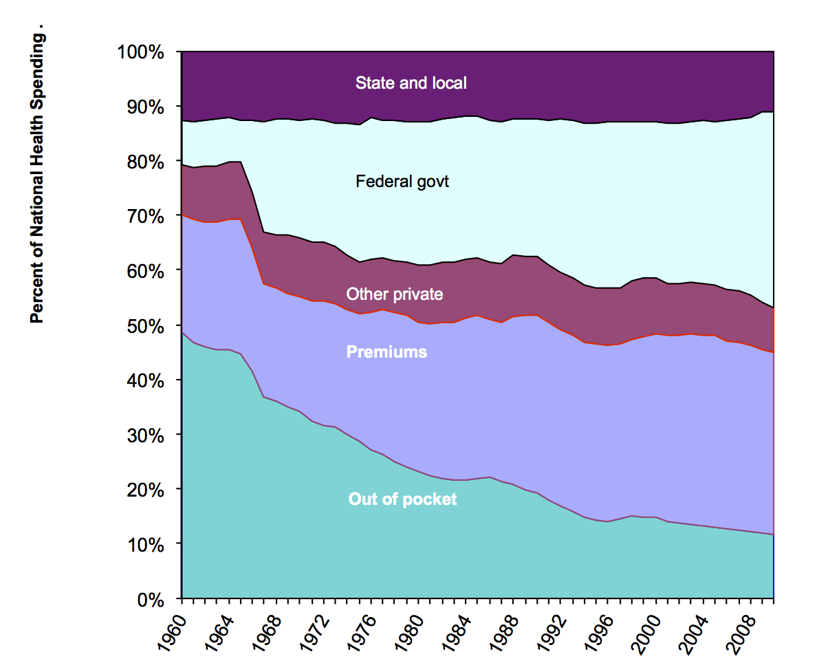
This graph separates the private share into out-of-pocket payment, payments by private insurance, and other. I reversed the vertical order of the sections, so you can better see how the private share divides. Over the decades, a smaller and smaller share of health spending has been out-of-pocket.
Out-of-pocket spending's share declined from nearly half of health spending in 1960 to just over one dollar in nine in 2010. Deductibles and copayments are getting higher, which means more out-of-pocket spending, but public spending has growing faster. Insurance premiums as a proportion of health care spending has been falling gradually since 2003, down almost to 33% in 2010.
The Federal share jumped in the 1960s when Medicare and Medicaid started. The Federal share has continued to grow. This is partly due to the aging of the population. More Americans are old enough for Medicare than ever before. Mostly, though, it is due to expanded coverage by Federal programs, especially Medicare and Medicaid.
I mentioned above that this breakdown understates the public role in health care finance share by not counting the tax subsidy for private health spending. There is another part of public spending that also appears in this chart as "private." This is government employee health insurance through private insurance plans. When a government employee elects, say, the Kaiser health insurance plan, that counts here as private spending. So, overall, these figures make private spending on health care look bigger than it really is, and they make public spending look smaller.
Some politicians like to claim that philanthropy can replace government health care programs. You should know that philanthropy is less than half of that narrow marroon band in the middle of the chart labelled Other Private. Most of the Other Private money -- more than philanthropy -- is what hospitals make from parking fees, the gift shop, and the cafeteria.
Philanthropy, by the way, means money donations. The value of volunteer work is not included at all in national health expenditure, or in the GDP, for that matter. The GDP only includes money flows that pay for goods and services.
Notice that there is no category here for uncompensated care. That is because only money flows count here. The money that providers get to help cover uncompensated care is here. Government indigent care funds are part of public spending. Money that providers get for uncompensated care by higher charges to insured patients is here, too. It's part of private spending.
Revisions end here.
Now, what the money was spent on:
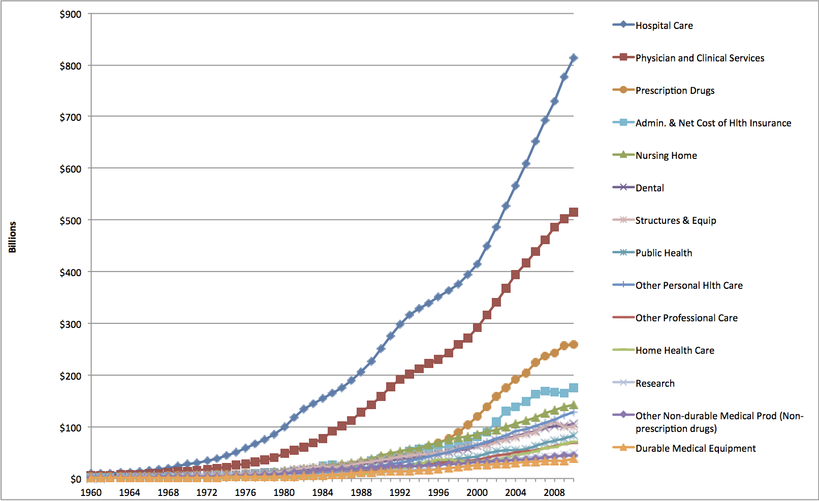 |
This shows the amounts spent, in billions of dollars, on each major category of health services and supplies. Hospital care spending in 2010 was over $800 billion dollars. It's the biggest single category of health care spending. Physician services is second biggest, at about $500 billion. Pharmaceuticals is third biggest, at about $250 billion. Nursing home care, which was third biggest from about 1985 to 1995, is now fifth biggest. It was overtaken by pharmaceuticals and administrative cost for insurance. Toward the bottom is Research. This includes research such as is done at our School and other such institutions. Research done by pharmacetical companies is paid for by their sales of drugs, so it is included in the pharmaceutical spending category. Similarly, hospitals' and doctors' offices' administrative costs are in the hospitals and physicians lines respectively. The Administration line is only what it costs the insurers to run their programs. |
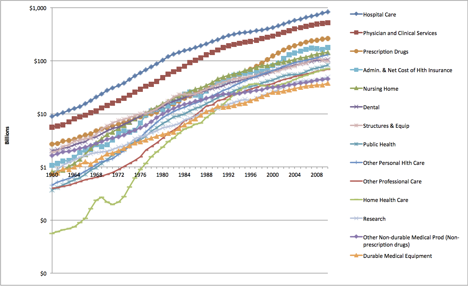 |
This shows the same data with a logarithmic Y axis. Straight
lines on a logarithmic graph are constant growth rates. Steeper slopes mean higher growth rates. This graph also helps you see what is going on in the earlier years with some of the smaller components of the health care system.
The fastest growing parts of the health care system from 2008 to 2009 were home heatlh care and other personal health care, meaning professional services not from doctors. Zero or negative growth was in dentistry, durable medical equipment, administration, and structures and equipment. Hospital care's fastest growth was before 1983. (Notice how hospital care's line is less steeply sloped after 1983 than before.) Physician services growth peaked later, around 1992. Pharmaceuticals' growth picked up around 1996. Growth didn't stop, or turn negative. These sectors kept growing, but by a smaller percentage. Their growth rates picked up around 2000. Nursing home growth was rapid in the 1960s and 1970s. After that, growth slowed. Home health grew fast from a small start, but its growth rate slowed in the mid-1990s. The bumps and dips in home health spending show how much this industry was affected by government policy changes. |
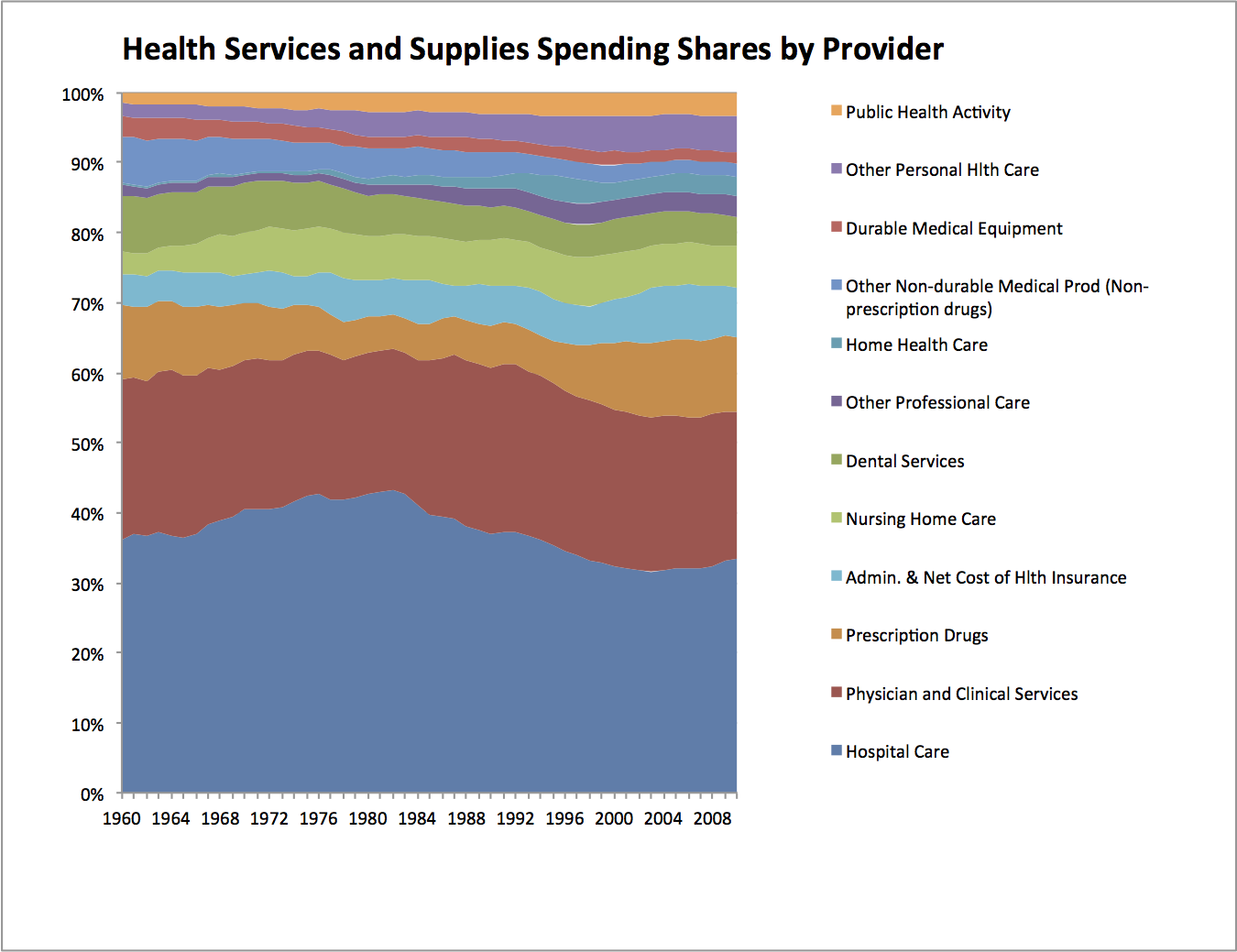 |
This graph shows, for the years 1960-2009, relative shares of the health health services and supplies dollar. That is everything in the preceding graphs except research and construction. I put public health at the top of the graph. That lets you see how public health's small share rose from 1960 to 2000, then levelled off pretty much. Administrative cost's share rose from 2000 to 2007, but fell in 2008 and 2009. Nursing home care grew rapidly in earlier years, but recently other sectors have grown faster. Home health care's has grown. Prescription drugs got left behind a bit in the 1960's and 1970's, but have since more than come back. Physicians generally maintained their share. Hospitals' share rose from 1960 to 1983. From 1983 to 2001, hospitals' share fell. This does not mean hospitals were getting less money. The preceding graph shows that hospital care was growing, by a lot. It just means that other parts of health care grew faster, from 1983 to 2002. Since 2003, the hospitals' share has been creeping up. |
That is your general overview of U.S. healthcare spending. The most in the world! But do we get good value for all that spending? That's what a lot of this course is about!