Instructions for this demo are down below the graph.
This applet shows a scatter of points generated by the equation
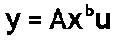
u is the error, which is multiplied rather than added. The error u
does not have a mean of 0. Rather, for this model, we assume that its logarithm has a mean of 0. We further assume that log(u) has the normal distribution.
To see why we make these assumptions about u, take logarithm of both
sides of the above equation. You get:

Now you have an equation that conforms to the assumptions behind using
least squares.
It is of the form Y = a +bX + error. Just define Y as log(y), X as
log(x), and the error as log(u).
According to our assumptions about u, this error, log(u), has a normal
distribution error with a mean of 0.
When log(u) is 0, u is 1. u can never be 0 or negative, because no matter what value you pick for log(u), u is always positive. Consequently, Y is always bigger than 0, so long as all the x's are bigger than 0.
A straight line in a graph with axes log(x) and log(y) usually translates
into a curve when the axes are x and y, as they are in the picture above.
Only if b is 0 or 1 do you get a straight line in the x, y plane.
The applet above starts with b = 1, so the points do group around a
straight line. Notice that the points fan out -- the vertical width
of the scatter changes from left to right. The fanning out indicates
heteroskedasticity of the errors, which means that the errors' variances
are different at different values of x. Also characteristic of this
distribution is that the points above the line are more spread out vertically
than the points below the line.
If you fit a straight line to data points that are actually generated
by this kind of power function, you will see a similar fanning and skewing
in your residuals.
To change the b value, click on the white box. Type in your choice
of b value. Then press Enter to clear the screen and begin drawing
points with the new b value. b values other than 0 or 1 give a curved pattern. b values between +2.0 and -1.0 give the best-looking results.
When b > 0, the points fan out to the right. When b < 0, the
points fan out to the left.
When you change b, the applet adjusts the parameter A so that most of
the points on the graph appear where we can see them.
The specifics of the adjustment of A are:
- For b > 0, A = 5 times (10 to the -b power).
- For b <= 0, A = 5.
Changing A like this stretches or shrinks the vertical scale,
but does not change the shape of the curve or the funnel pattern of the
points.
Click the Freeze/Unfreeze button to stop or start adding points.
The counter shows the total number of points added.
The first time a point is drawn, its color is magenta.
When
there is a subsequent call to draw the same point,
the point is made slightly
darker, by subtracting some of its color.
For the 2nd through the 16th hit on the same point, a small amount of red
is subtracted, until the point is pure blue.
For the 17th through 31st hits, red is subtracted, until the point
is black. After 31 hits, the color is not changed any further.
Click the Show/Hide button to show or hide the curve y = A times (x
to the b power) in yellow. This is the "true" curve, without any error.
The curve flickers, unfortunately, when the screen is updated.
© 2000 Samuel L. Baker
The author is solely responsible for this page. Its contents
have not been reviewed or approved by the University of South Carolina.
http://hspm.sph.sc.edu/COURSES/J716/demos/ScatterPlots/LogLogScatter.html
February 4, 2001